This classic novel re-design was a project for my postgraduate course at Kingston University. I selected the novel The Strange Case of Dr Jekyll and Mr Hyde because many of its editions use similar color schemes and imagery, and I wanted to subvert these and create something different. My aim for this project was to create a modern design that would look fresh and eye-catching, and would draw the attention of the average reader who may have avoided this book in the past due to its age.
My primary target market is students who are required to purchase this book for school; the attention-grabbing, modernized cover would spark their interest in the content. My other target markets include readers who love this particular book and may collect its various editions, and readers who collect artful editions of classic novels in general.
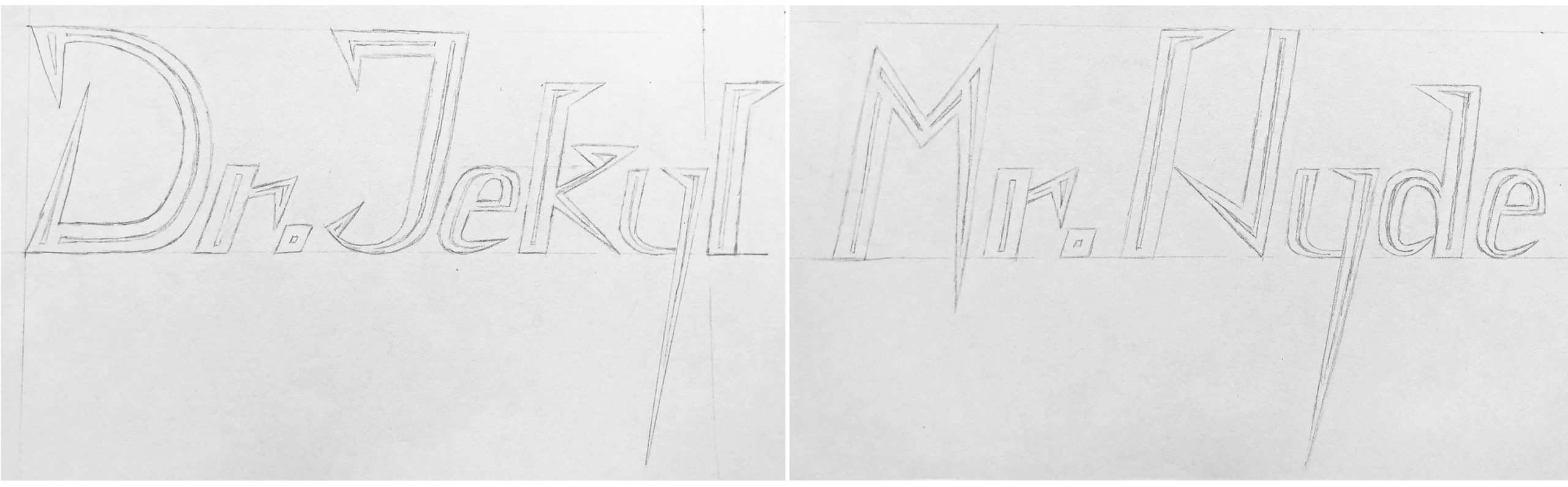
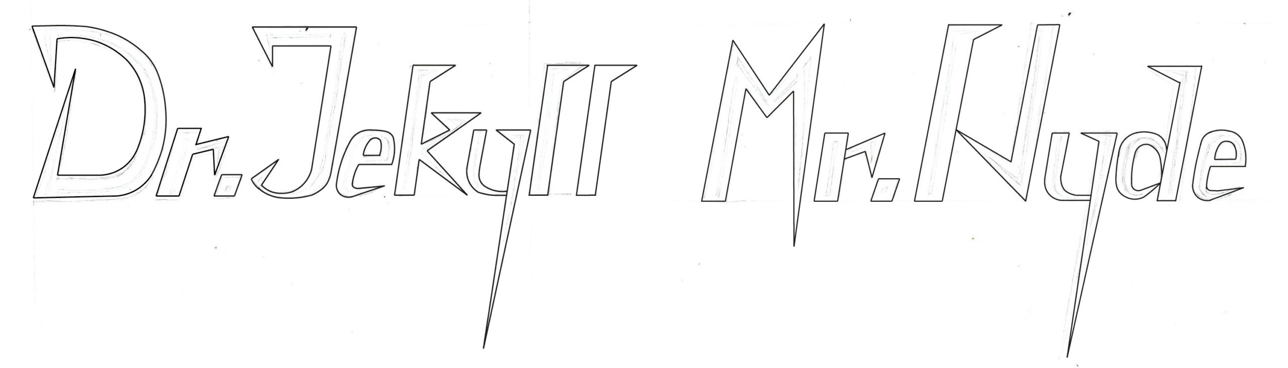
To achieve a modern look, I hand-drew and used Adobe Illustrator to create clean, geometric typography for the names Dr Jekyll and Mr Hyde. I used solid blocks of colour against a solid, neutral background. For the remaining cover text — and for the chapter titles, running-heads, and page numbers — I chose Tw Cen MT Condensed, a sans-serif font that looks simple and streamlined. Many other editions’ covers use elaborate, ornamented typography to reflect the time period of the book’s publication. With my artwork and font choice, my design is unique among these other editions.
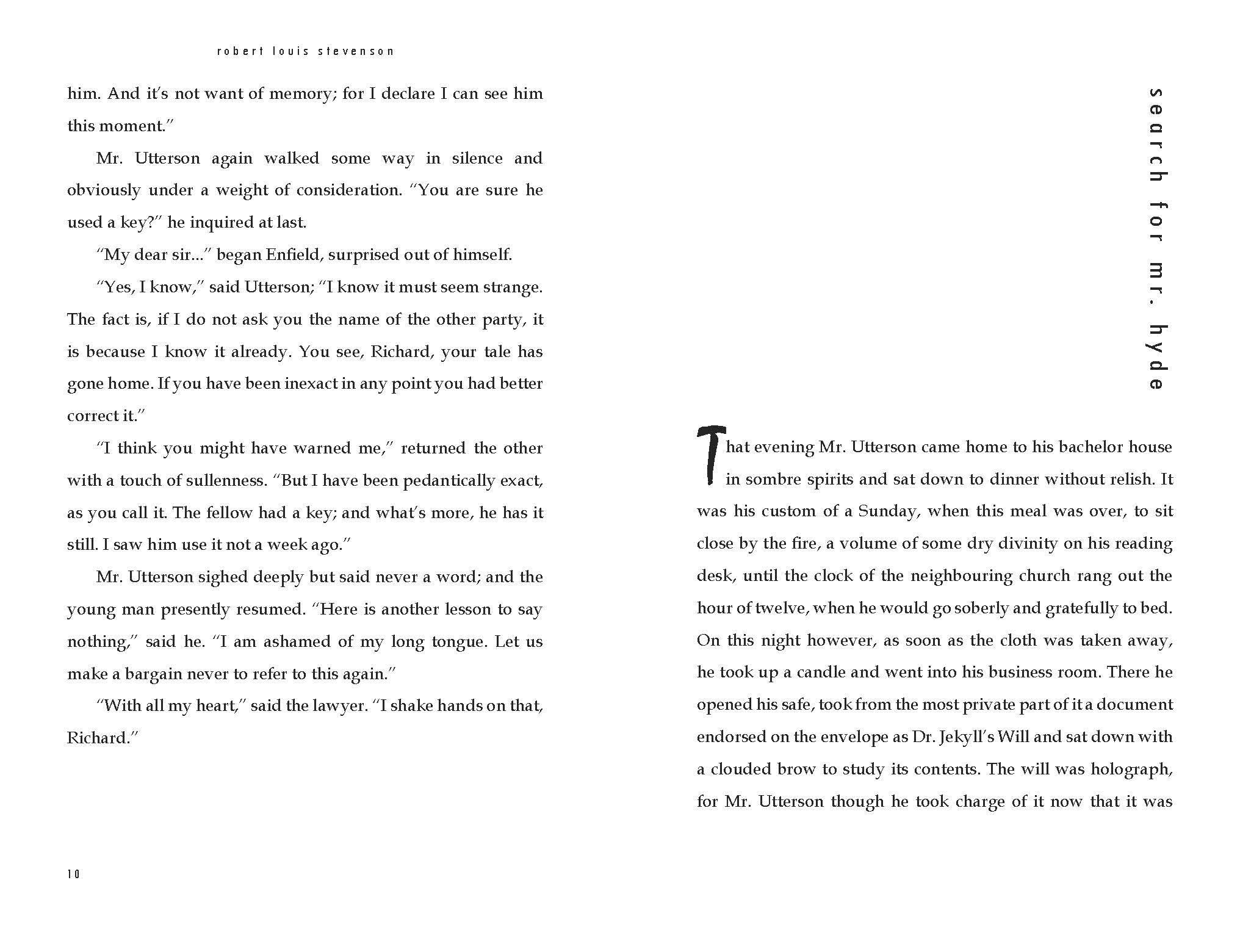
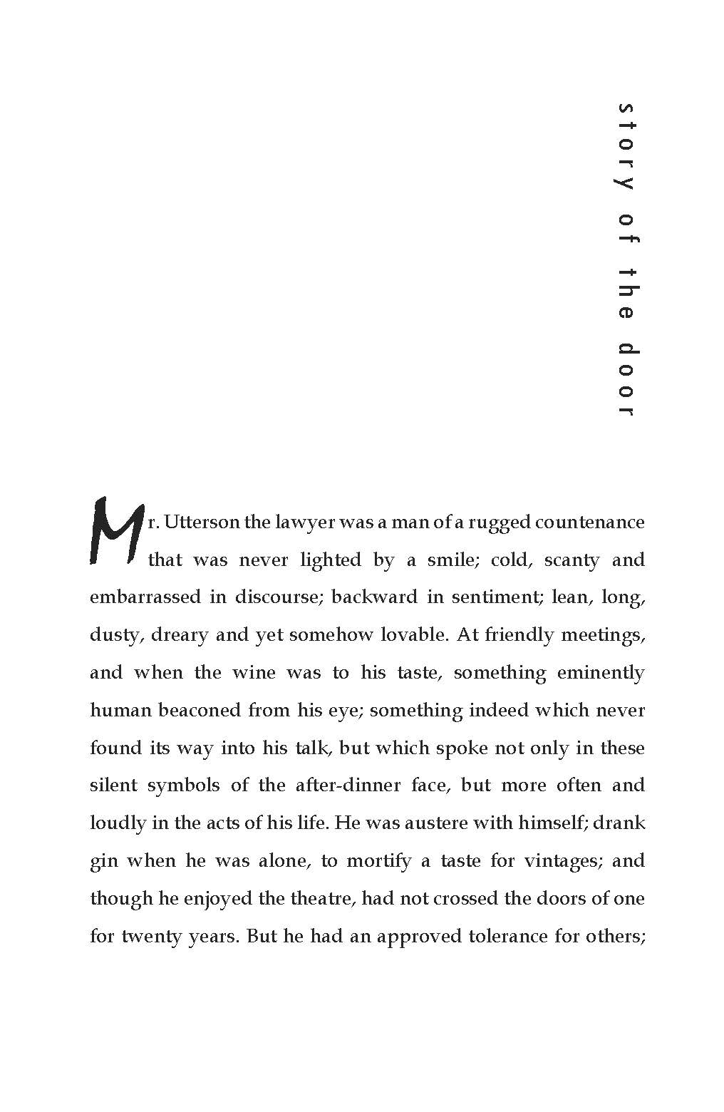
I selected Book Antiqua for the body text; I chose this to acknowledge the book’s time period despite the overall modern design. For the drop-caps I used Mistral, a messy and erratic handwritten font that captures the unwell mental state of the protagonist.
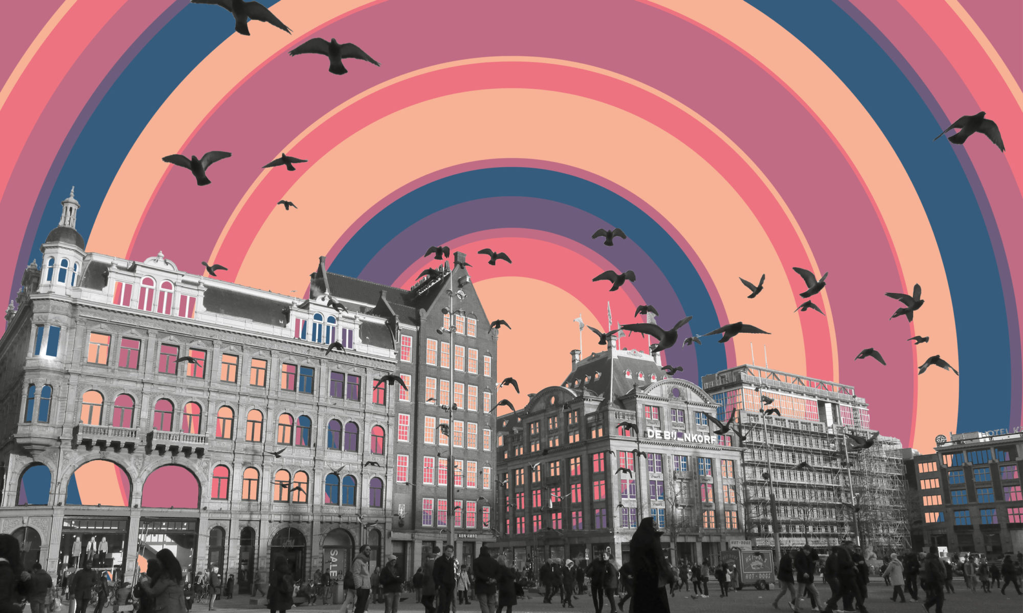
My cover captures the essence of the book as a work of mystery, gothic horror, and science-fiction. I selected colours that would evoke a sense of darkness and the protagonist’s mental state: dusky grey, deep turquoise, and sickly yellow-green. I doubled the names Dr Jekyll and Mr Hyde to symbolise the protagonist’s split personality. Other editions portray this concept with the figure of a man and his shadow upon a wall. Instead of this, I used the doubled typography to create this shadow. The sharp points of the letters also convey a feeling of danger, representing the horror apsect of the book.
Below are the stages of development for my cover artwork. Beginning by hand-drawing the letter forms, I scanned my sketches and then used Adobe Illustrator to outline them. I then duplicated them to create the shadow effect and filled them in with colour.

This project has inspired me to create other re-designs of classic novels in the public domain. In the future I intend to design covers and interiors for some of my favourites including Alice in Wonderland and Frankenstein.