
Cartograph is an original app idea that I created for my Interaction Design module at London Metropolitan University in the spring of 2021. Cartograph is an educational app that enables learning, studying, and quizzing through interactive geographical maps. Intended for the US market, it has two primary target-user groups: K-12 students and their teachers.
The app is meant to be used by these two groups in an interconnected context: teachers can create, edit, and share interactive digital maps with attached lesson material for their students to review; students can read and study the maps and their attached lesson material, and then take quizzes afterwards, so that teachers can gauge their learning progress. The app also contains a database of pre-built maps created by the publisher, which teachers can adapt to suit their unique lesson plans.
Cartograph is best suited for history- and geography-based classes, however teachers of other subjects may find it useful when geographical location is a relevant component in the lesson. The app is (hypothetically) owned by a US-based educational publishing company that produces textbooks and digital educational materials for K-12 students. The app is intended for use both for homework and in the classroom, both individually and in groups. Students can utilise it to learn new material as well as study past lessons and take practice quizzes in preparation for exams.
I created two separate versions of the prototype for each of my two user groups, which are viewable in your web browser through the links below. Give Cartograph a go!
My UX Design Process
I designed this app over the span of several months, implementing User Experience design principles and best practices in a methodical, step-by-step design process. I began by researching and defining the requirements of my two user groups, students and teachers, recognising that they would have some user requirements in common as well as some varying ones:
Students’ and teachers’ requirements
- Easily and quickly navigate the interface to view its contents
- Access all content in one organised, central location
- Use the app in any physical location, both with and without access to WiFi or mobile data
- Receive instant feedback and fast loading of content in response to the user’s interactions
Students’ additional requirements
- View and keep track of learning progress and completed tasks
- Study and practice learned knowledge in preparation for exams
Teachers’ additional requirements
- Easily create and share interactive maps with students
- Receive, view, and assess students’ quiz data
I also outlined the two user groups’ motivations for using the app:
Students’ motivations for use
- Easily and efficiently complete the assigned homework, whether at home or on the go
- Quickly access the lesson material for multiple classes in one location
- Self-assess learning progress through quiz data
- Practice knowledge and study for exams
- Enjoy the experience of using the interface
Teachers’ motivations for use
- Present lesson material in a more interesting, interactive, and engaging way
- Quickly access and disseminate the lesson material for multiple classes in one organised and central location
- Utilise technology for the purpose of learning rather than as a distraction
- Quickly assess students’ learning progress and pinpoint students who are falling behind
- Provide students with a useful study tool for exams
- Enjoy the experience of using the interface
Based on the user requirements and motivations that I discovered, I developed the following list of the app’s activities, purposes, and benefits:
Student activities
- View, navigate, and engage interactively with digital maps
- Learn the physical locations of places and historical events in relation to each other
- View textual and visual lesson material attached to each location on the map
- Access lesson material and maps in one central, organised repository of ‘libraries’
- Practice and self-assess the knowledge learned from the lesson material through quizzing
- View previous quiz scores to self-assess learning progress
Teacher activities
- Create and share maps and lesson material in an interactive and engaging way
- Access lesson material and maps in one central, organised repository of ‘libraries’
- View students’ quiz scores
- Assess stuedents’ knowledge and learning progress
Purposes and benefits for students
- Helps students learn the material in an interactive and engaging way
- Enhances and reinforces assigned reading
- Gives students a visual understanding of the material in a digital format they are familiar with
- Consolidates maps and lesson material from multiple classes into one easy-to-use and organised location
- Eliminates the need to spend time searching in a textbook for a specific map
- Provides opportunities to study and practice learned knowledge
Purposes and benefits for teachers
- Helps teachers present their lesson material in a more engaging and interactive way
- Gives teachers a way to utilise digital technology for the benefit of learning, both in the classroom and for homework, rather than as a distraction
- Consolidates maps and lesson material from multiple classes into one easy-to-use and organised location
- Allows teachers to assess students’ understanding and pinpoint students who are struggling
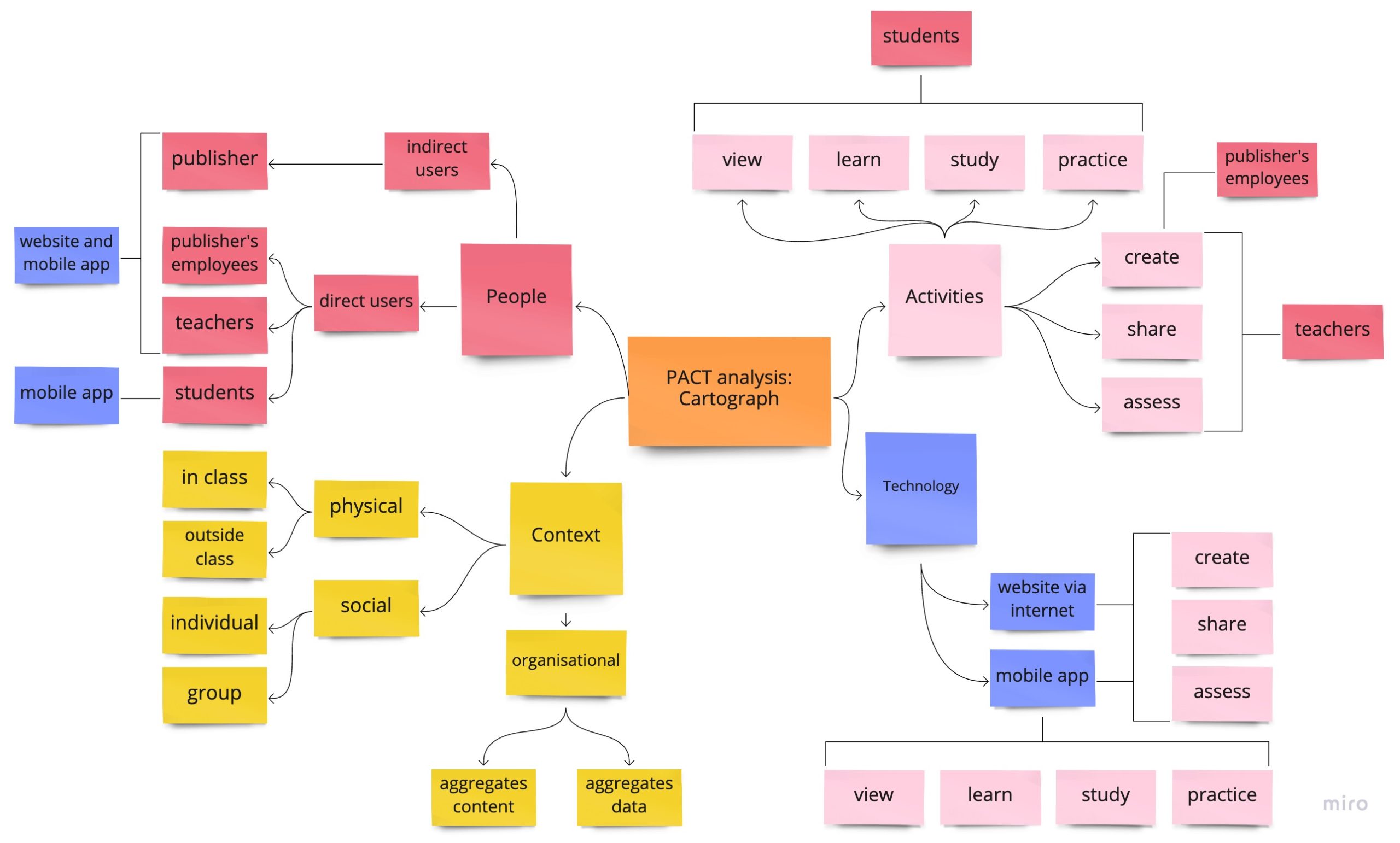
After completing these steps, I created a PACT Analysis chart to visualise the app’s activities, interactions, and contexts and means of use:
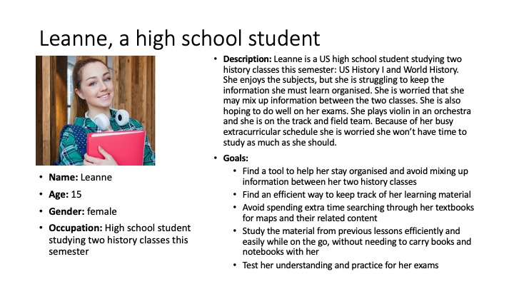
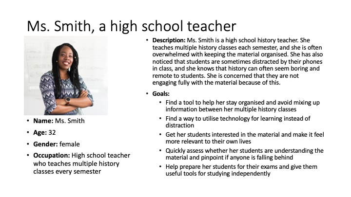
Based on my analysis of user requirements, motivations, and activities, and following best practice in constructing user personas, I developed a persona for each of my two user groups to better understand their perspectives:
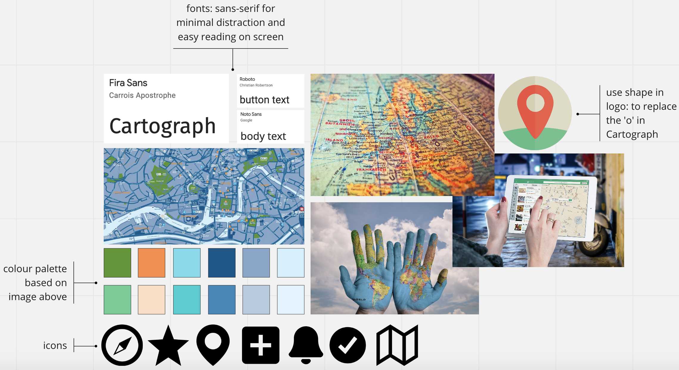
I conducted visual research and developed a mood board for the app, to establish a basic colour scheme, visual theme, and get an idea of the icons and typefaces I would be using:
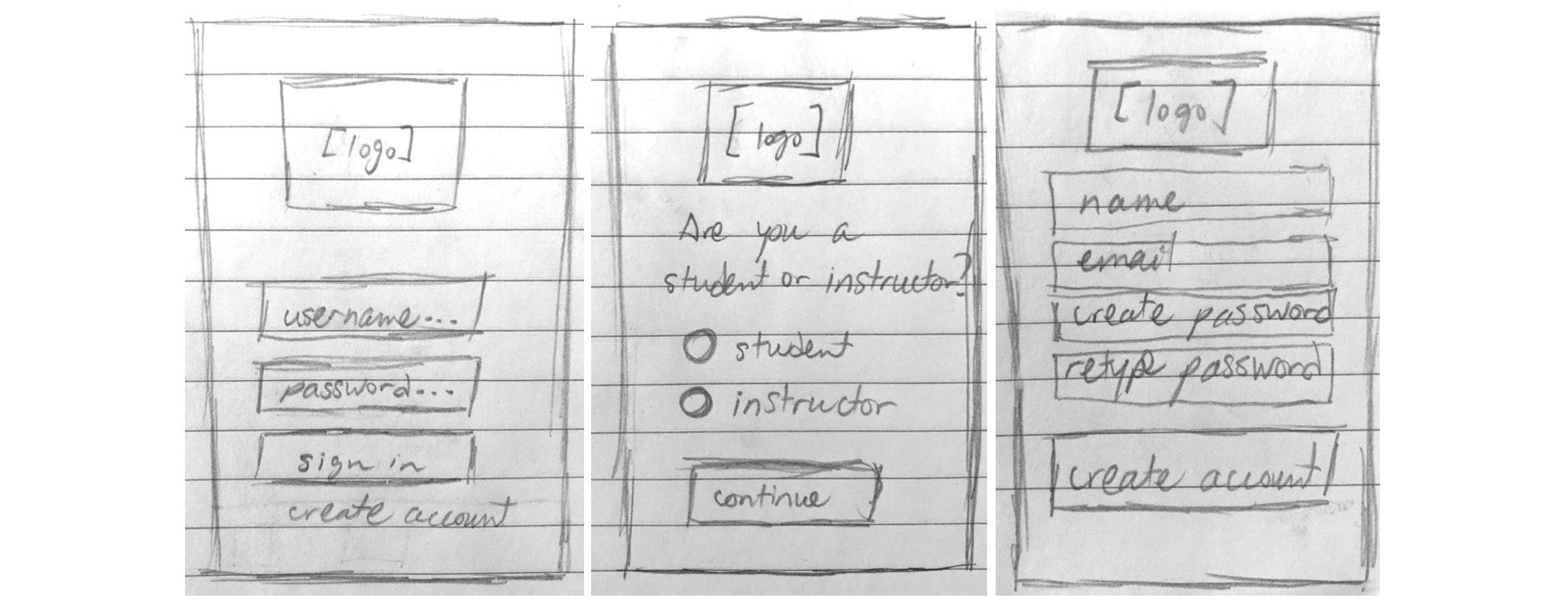
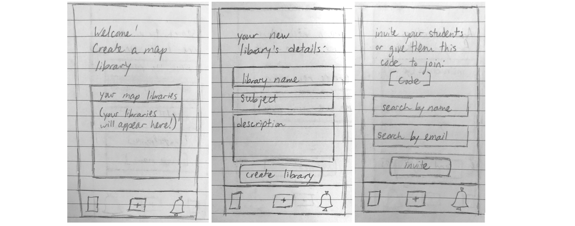
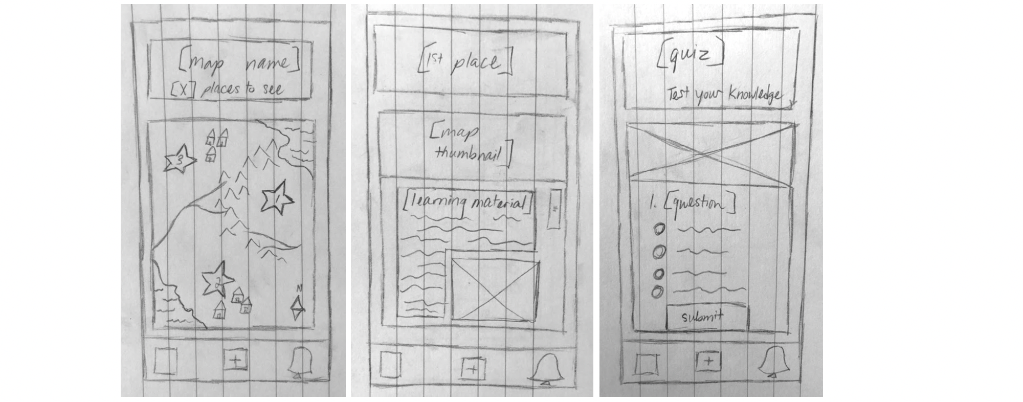
I began sketching low-fidelity prototypes demonstrating various activities within the app, editing them over time as I gained a more in-depth understanding of how my two personas would approach using the app. Below are a sample of the sketches I made throughout the design process:
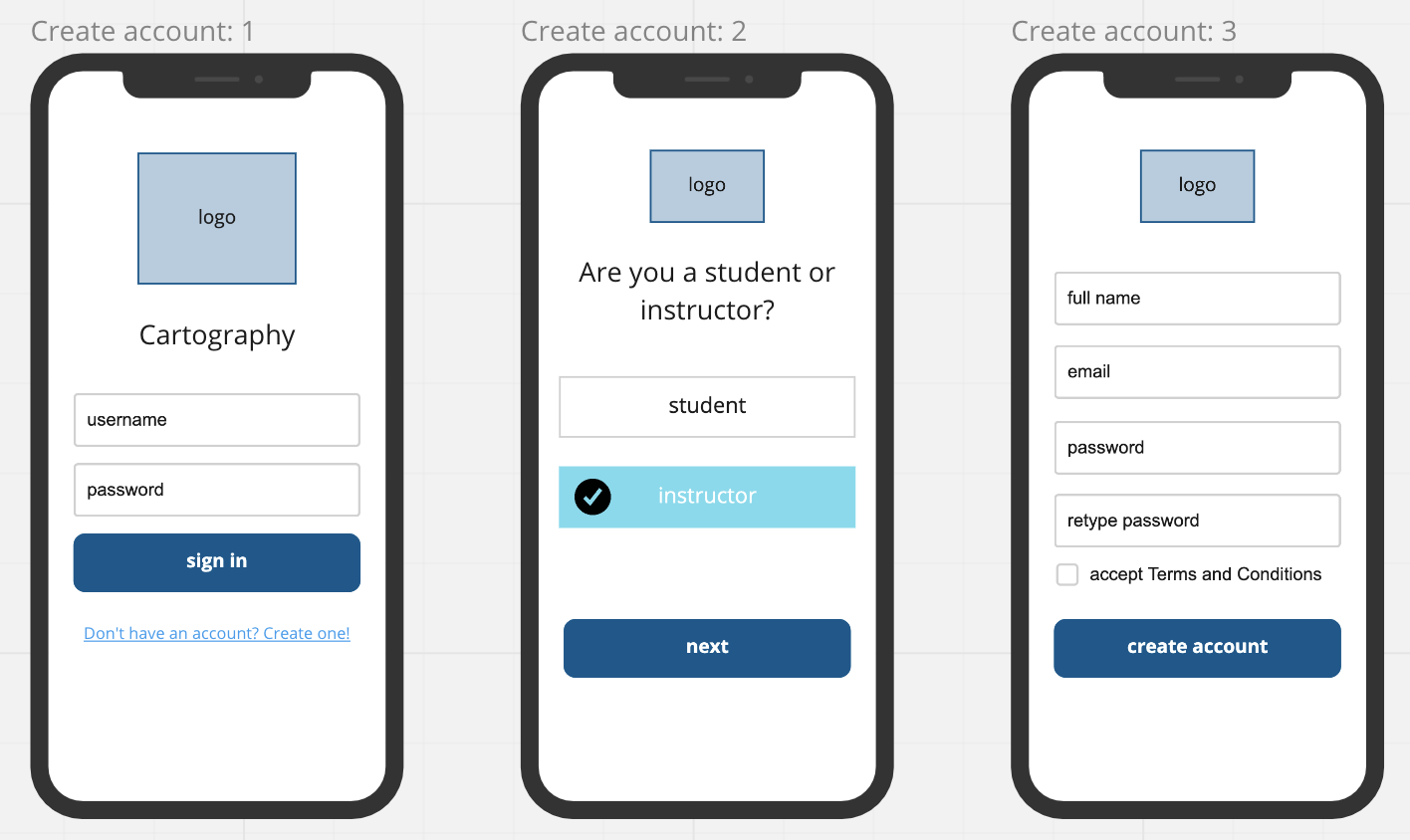
Creating an account
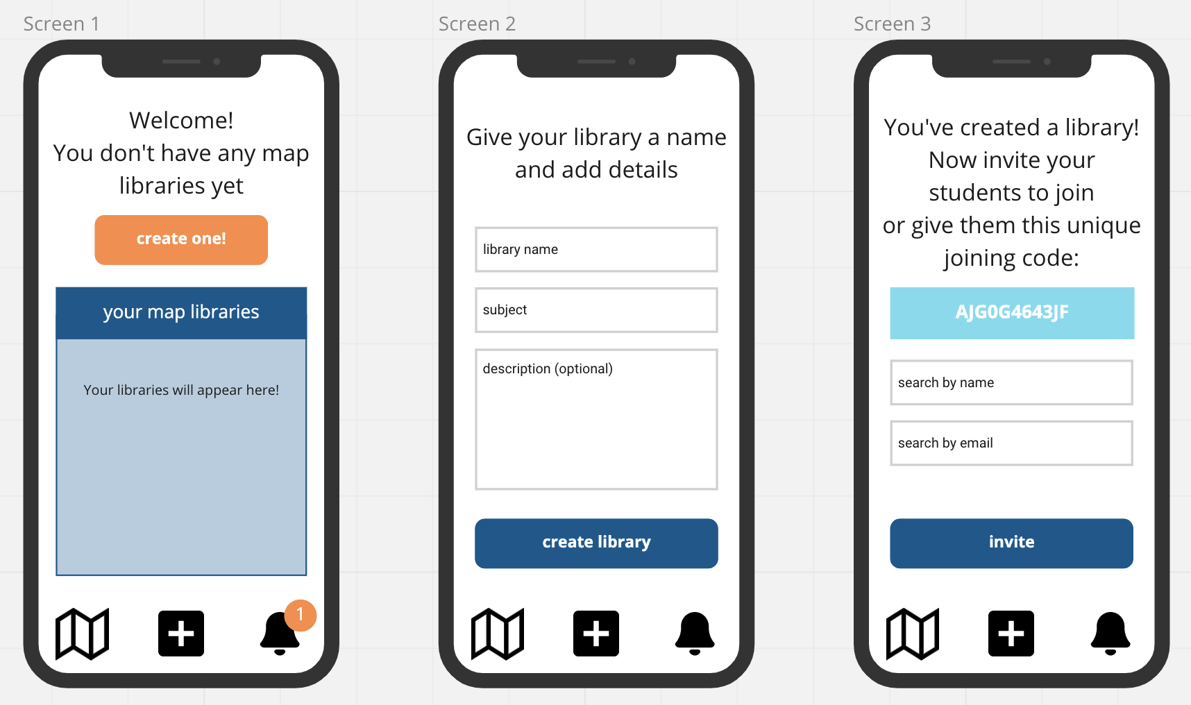
Creating a map library (teachers)
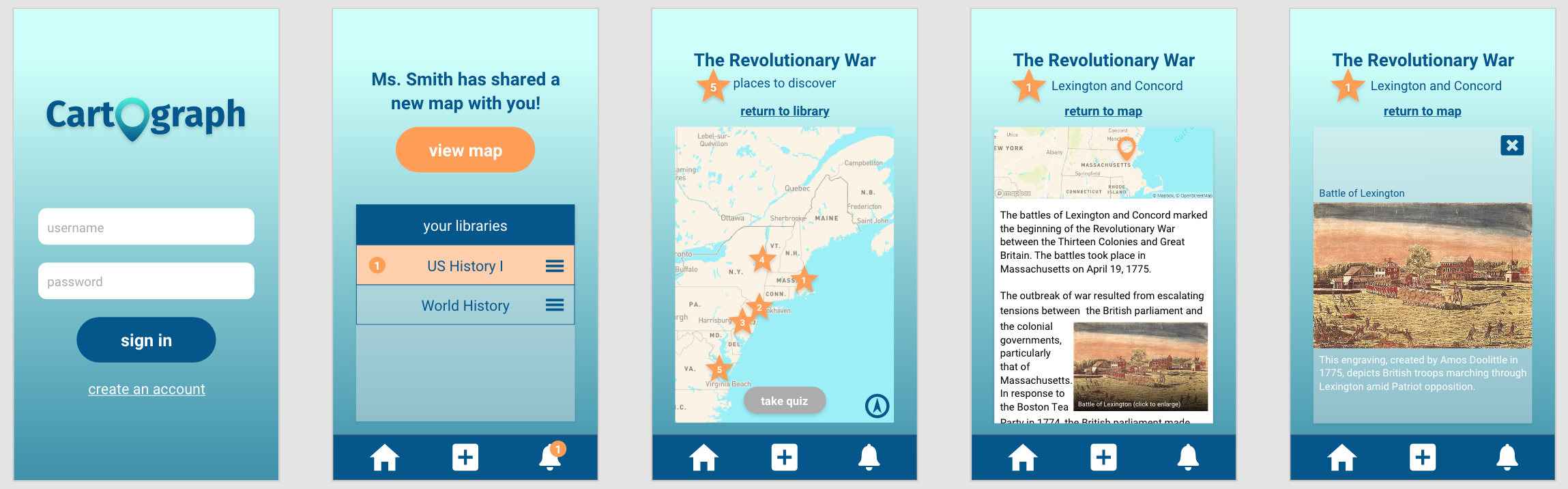
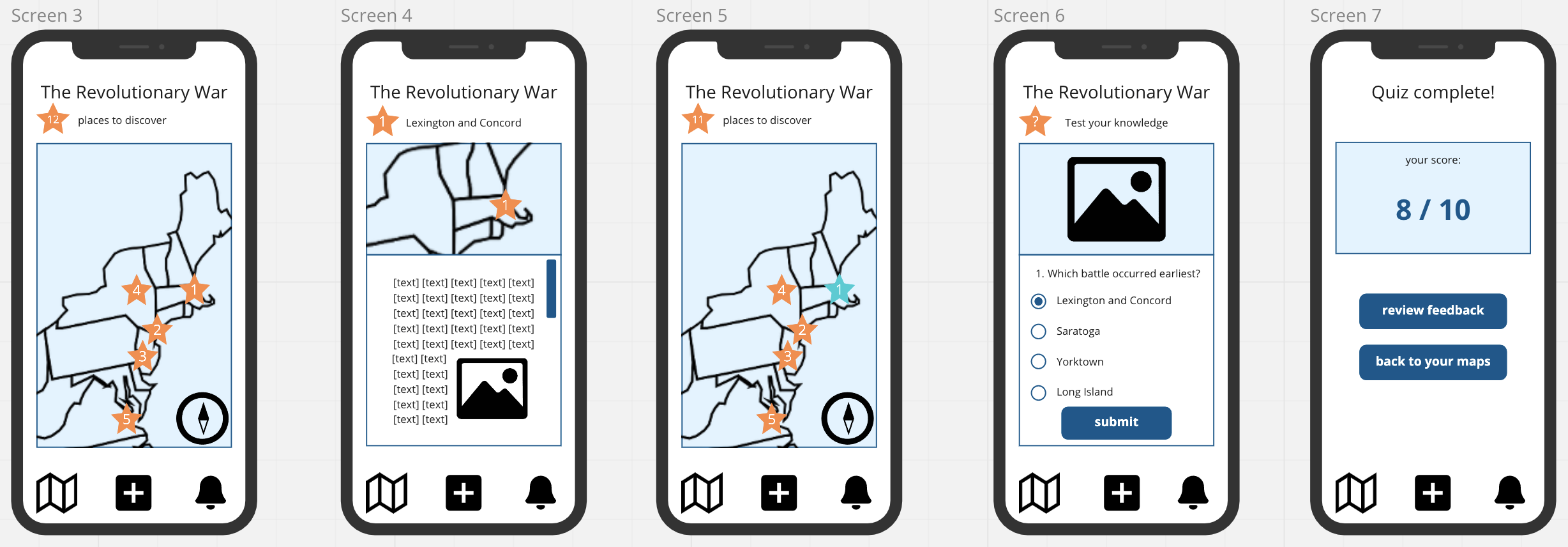
Viewing a map and taking a quiz (students)
This low-fidelity prototyping process helped me to formulate scenarios of use that my two user groups would experience when performing the app’s various activities. Using these scenarios to determine how the app could best be designed to serve the users, I went back and refined its features to optimise usability and accessibility. I created digital versions of my sketches using Miro, adding colours and details:
Creating an account
Creating a map library (teachers)
Viewing a map and taking a quiz (students)
Usability and Accessibility
I designed my high-fidelity prototype with accessibility in mind, consulting literature on mobile app accessible design, including W3C’s Web Accessibility Initiative, the Interaction Design Foundation, and Creative Bloq. My colour scheme was influenced by best practice in visual design for people with colour blindness. My font selections were guided by accessibile design for people with dyslexia; like most sans-serif typefaces, the Roboto typeface has high readability due to its simple character shapes; they are also more legible for reading on screen in particular. I also set text elements at reasonable sizes to increase their readability on small screens, and I used a bold font for all button text to indicate their purpose.
I tried to maintain a consistent interface and navigational structure throughout the app, as consistency of structure is best practice for people with cognitive and visual disabilities. When possible, I left ample space between interactive elements so that they are as easy to select as possible without accidentally selecting another nearby element. These are a few of the measures I took in designing Cartograph to be usable for all.
My last step in creating Cartograph was to design my high-fidelity prototype using Adobe XD. I created two different versions of the app, one for each of my user groups. Click below and try out Cartograph for yourself!
![]()